Understanding Your Analytics Dashboard

Every click on a Middlewr short link is tracked and visualized in your analytics dashboard. This is where you go to answer questions like "how many people clicked?", "where did they come from?", and "which devices are they using?". Whether you're monitoring a single campaign link or reviewing workspace-wide performance, the dashboard gives you the data you need at a glance. This guide walks you through each section.
Prerequisites
Before you begin, make sure you have:
- A Middlewr account
- A workspace where you have at least the Viewer role
- At least one link with some click data (share a link and click it a few times to generate data)
Step 1: Access the analytics dashboard
In the left sidebar, click Dashboard or Analytics under the Analytics section. This opens the workspace-wide analytics view showing data across all your links.
To view analytics for a specific link, click its click count in the links table — you'll be taken to the analytics page filtered to that single link.
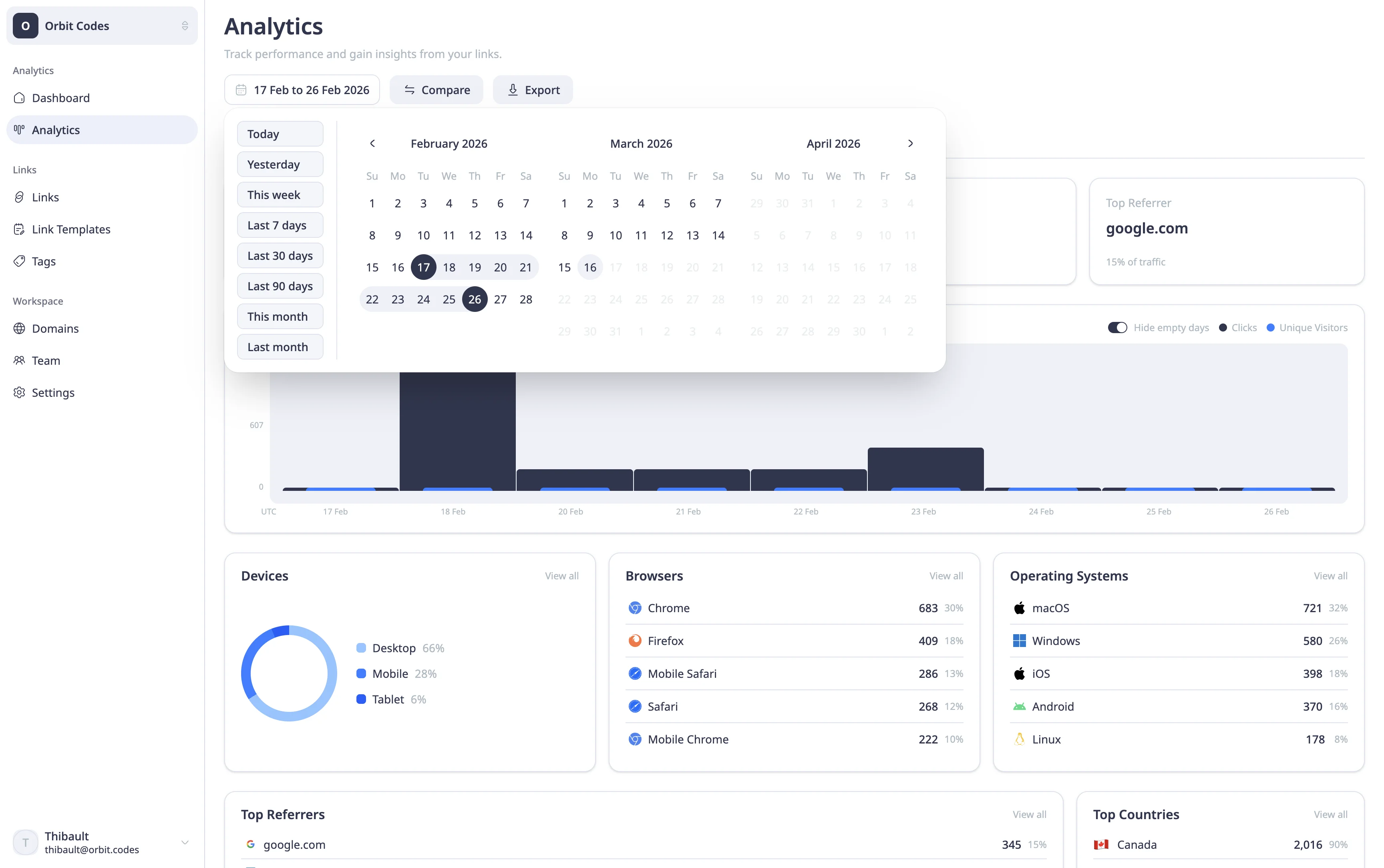
At the top, you'll find a date range selector with quick presets (7 days, 14 days, 30 days, 90 days) and a custom range picker. The dashboard defaults to the last 30 days.
Step 2: Read the key metrics
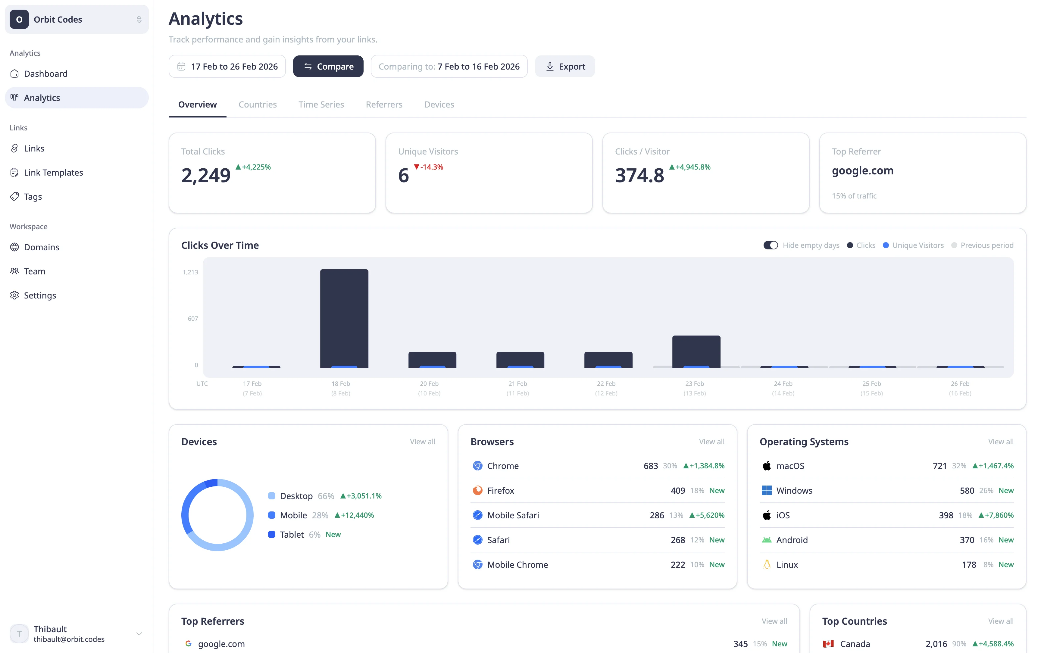
The top section displays four stat cards summarizing your performance:
- Total Clicks — the total number of times your links were clicked in the selected period.
- Unique Visitors — the number of distinct visitors (deduplicated by IP or fingerprint).
- Clicks/Visitor — how many times each visitor clicked on average. A number above 1 suggests repeat engagement.
- Top Referrer — the website or source that sent the most traffic to your links.
If you've enabled comparison mode (via the Compare toggle), each card also shows the change versus the previous period as a percentage delta — green for growth, red for decline.
Step 3: Explore the breakdowns
Below the stat cards, you'll find detailed breakdowns organized into visual panels:
-
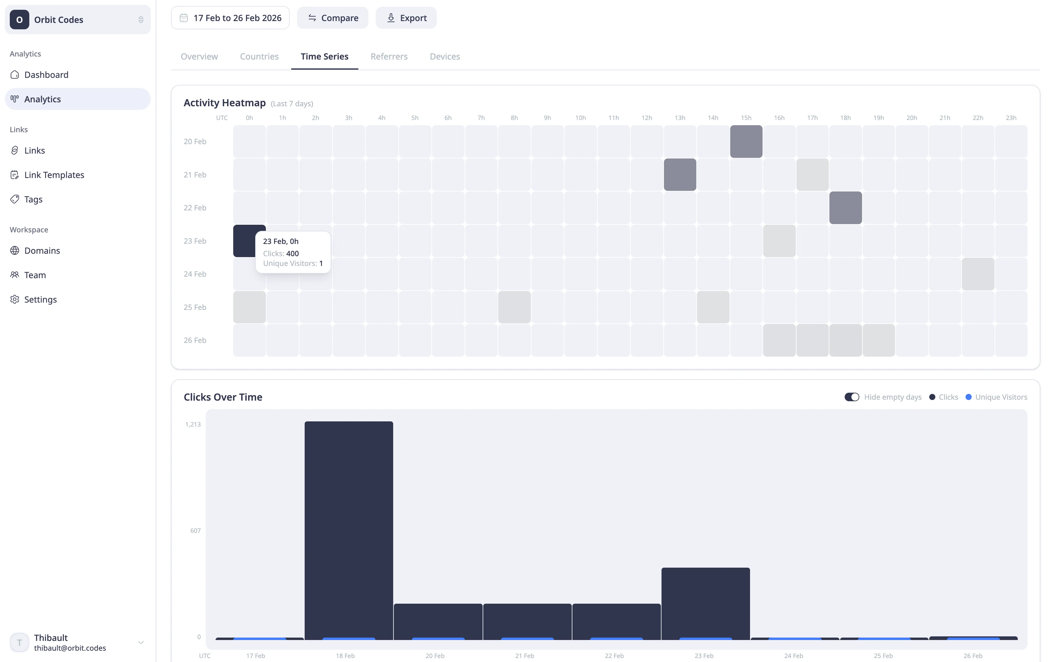
Clicks over time — a line chart showing click volume and unique visitors per day (or hour/week/month depending on your date range). Toggle "Hide empty" to remove zero-data periods for a cleaner view.
-
Devices — a breakdown of desktop, mobile, and tablet traffic. Useful for understanding whether your audience is on the go or at their desks.
-
Browsers & OS — which browsers (Chrome, Safari, Firefox) and operating systems (Windows, macOS, iOS, Android) your visitors use.
-
Referrers — the top sources driving traffic to your links. This includes direct traffic, social platforms, websites, and email clients.
-
Countries — a geographic distribution showing where your clicks come from, displayed alongside a world map.
You can export the timeseries data as CSV for further analysis using the download button in the chart header.
Using comparison mode
Click the Compare toggle to enable period-over-period analysis. Middlewr automatically selects a matching comparison period — if you're viewing the last 30 days, it compares against the 30 days before that. You can adjust the comparison dates manually if needed.
Comparison data appears as a dashed overlay on the timeseries chart and as delta percentages on each stat card, making it easy to spot trends.
Going further
- Set up UTM tracking — add UTM parameters to your links so you can cross-reference Middlewr data with your external analytics tools
- A/B testing with split routing — run experiments and track which variant gets more clicks
- Manage billing and plans — analytics data retention depends on your plan — upgrade to access longer history